Basic settingsand sliders
The key, which does not require the use of special equipment and are made with the eye and which require advanced sensors (fwtospektrometra or color analysts) and software that ‘ reads ‘ measurements and directs us to the proper setting of our instrument. The advanced settings are the grayscale calibration in accordance with the standards, the gamma and color setting (where we have the opportunity and the sliders like CMS, Color Management System). In this article we will deal only with the basic settings. It will follow another article dealing extensively with the Advanced.

Before we begin, let us bear in mind that:
The image is a chain of interaction parameters. Therefore, everything that we matter affects almost always … everything!! (not confused anyone, I’m not talking about the adorable animals!). Therefore, it is not possible by pressing two buttons to get the perfect picture. Let’s not forget that our machines have their limits, their limitations. So, many times a compromise is necessary when the instrument cannot sit perfectly on the REF. (happens in 99% of cases). I close with the introduction and go immediately to the main theme … However, because I’m a chatterbox, you will zalisw a little longer with some key!!!
F O S:

Light is the most important topic in projection issues. Is the engine of the car is like the heart in the human body. It is what defines what we see and how we see it. The questions are routine:
- How much light do I need for video projection;
- The light on my screen?
- I want to open 150 inches. I reach 500 Lumens (brightness measurement unit);
- To get a white or gray screen; With small or large gain (gain);
To solve the above key issues you need to know certain things. What? These!!
nits = candela/m^2 (area over which candela are measured)
SG = screen gain
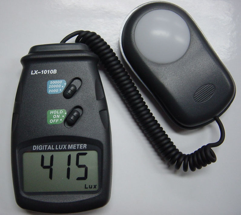
lux = (projector lumen output)/(screen area in m^2)
(lux * SG)/pi = nits
SG = (pi * nits)/lux
1FL=10,76 lux
1FL=3,426 nits
1nit=3,14 lux
And some round prices:
1 m ^ 2 = 16:9 Screen 61 ” (inches) = 134cm x 75cm
2 m ^ 2 = 16:9 screen 85 ” (inches) = 189cm x 106cm
3 m ^ 2 = 16:9 screen 104 ” (inches) = 231cm x 130cm
4 m ^ 2 = 16:9 screen 121 ” (inches) = 267cm x 150cm
5 m ^ 2 = screen 16:9 135 ” (inches) = 298cm x 168cm
There are 4 brightness values (in the broad sense) that we are interested in:
Lumens, Lux, FL (Foot Lambert), Nits.
The first two (Lumens – Lux) are units of measurement of brightness (illuminance) light emission from stationary source, e.g. our projector.
The second (FL – Nits) are units of measurement of luminance (Luminance) which measure emission or reflection of light from a flat surface, e.g. our monitor.
It becomes therefore understandable, how important it is to know its real and not fictitious brightness values/luminosity in order to have the necessary light according to the standards, which tell us the following:
When THX: 12 – 16 FLs
In SMPTE: 12 – 22 FLs
(in another article we will analyse why there is this difference between the minimum and the maximum value).
The above noymerakia are the basis of all our arrangement. If you are not satisfied, we’ll get the result will either be too dark, or too bright with the result in both cases fatigue for our eyes. You don’t do anymore, besides we will return to many times on this subject..
Go to the basic settings:
REGULATORY:
Brightness (suitable for adjusting the brightness to low IRE and delineation of best black – black point). Regulating we use below patern:

Touch the slider so the black us located at Digital 16 and with our bars flashing by 17 and up (17, 18, 19, etc.). This setting helps us to see all the details in dark shots non krassarontas (eliminating) the information that the Director wants to see or on the other hand avoid yperfwtizoyme area under 16 which destroys the absolute black level pepliazontas us our image in dark shots.
Question:
Nice … I did all that, but, again I veil in my picture. Why?
Because the overall brightness at the correct levels depends on the gamma correction, which fluctuates depending on the setting of RGB (grayscale). For this reason, some are called basic settings in the picture and we advanced. Hence it is understood that only with full calibration of all parameters of the image would get the best possible results from our media (always within the limits it allows us).
Contrast (regulatory responsible for demarcation of the white-point white).
Practical is the slider that adds or subtracts light throughout our image generally, by increasing or decreasing its intensity. For proper calibration of need the following tab/patern:

As a general principle, we matter the slider so that the bars to blink up to 235. From 235 and up, you should see a single white color.
Though:
Because the contrast setting affects many parameters such as The luminosities of colors, it is advisable to try to Flash our bars and over 235. There is no fix point about it. It will leave depends on the total light that we get. If e.g. We see several lines flashing above 235, but our overall light has fallen below the standards (12 FL), then we prefer to increase the overall lightness of the machine until you see the flashing bars to 235.
Question:
To get the correct brightness according to the specifications you must terminate the contrast slider. But when I do, I do not see any flashing bar. Can I leave it so?
The answer is no. In this way you will see everything ‘ mucked ‘ in the commonly termed and such an image is not acceptable. What Facem? As we wrote above, the light is the most important factor in our image. Therefore, first of all we observe brightness specifications/splendour. In this case required above light so that we can bring the slider of kontrast correctly without having to put all other parameters. Solutions:
1. Screen with greatest profit.
2. The projector closer to cloth (if the Zoom allows).
3. Smaller frame, fewer inches.
Color (or Colour), the slider is responsible for the brightness of the three primary colors (Red-Green-Blue).
Normally and naturally this should be the only use. As you will see, however, in practice, the arrangement brings many times undesired interference and in grayscale (some video models). This is not acceptable, so let’s be sparing in its use. If we can not speak at all, even better …
To see where we are with the three primary colors luminosities, we use the following two paterns:


The basic principle is the same as the Brightness/Contrast setting only that here we have a single slider that affects simultaneously all over the scale.
Question:
When I use the slider to setarw luminosities in tall IRE, break down those low and vice versa. What do I do?
With a single slider at our disposal the best that we have to do is to find a relevant balance and in tall, but, and low IRE. Something also important is that the controller in question stretches the brightness of primary colors at once and for all three. In our efforts can help and the contrast slider. If for example the high IRE see kliparoyme the colors up to 235 (polishing info) and even before they deal with the color slider, lower a couple clicks in contrast with the condition that we have competence. What interests us is seeing the captured information among 16-235. Therefore, if our bars flashing over 235, do not worry and leave it as is.
Remember that we are talking about the basic regulatory and any restrictions. In the capital of advanced settings will be able to setaroyme the luminosities of color without even dealing with the color slider or anyway, using the minimum.
Tint (Hue slider is responsible for secondary colors – magenta, cyan-yellow)
Saturation (buffer responsible for saturation of primary colors)
With these two sliders will not deal here, but in the advanced settings for the simple reason that the saturation and hue of six colors are defined based on fixed placement coordinates within the color triangle, which requires strict use sensor. Don’t even bother yourself with filtrakia/gelatin “regulating” these two parameters. It is likely to get worse and result from the default settings. Whoever told you that the created by eye. … cut of the good day to image issues!!!!

Sharpness (sharpness slider is our image. NB: the acidity is not clarity, even if many times gives us this impression). Regulating we use the following patern:

Touch the slider so that the horizontal and vertical lines to appear sharp without artifacts, the so-called ‘ jingles ‘ (ringing) in image or other undesirable interference as the so-called moiré.
Generally, and with this slider should be cautious and sparing in the use of.
The paterns you can find at this link:
http://www.avsforum.com/t/948496/avs-hd-709-blu-ray-mp4-calibration
Good settings!!!
Ygiainete!!