
In this chapter will deal with the color setting. The adjust color follows chronicles the basic settings (with which we have here) and grayscale calibration (which I discussed here).
Before we begin, it is necessary to mention some basic things. Setting the color behavior in our projector can be done either with the sliders of either having an external image editor. In this guide we will refer only to the first case. To do this, however, should our projector features a so-called cms (color management system).

This is nothing other than the menu responsible for the calibration of our colors. Our colors are divided into two categories, primary and secondary. Primates are the red, green and blue while the secondary is the cyan, magenta and yellow.
At this point it is necessary to highlight:
The arrangement of the colours will not affect at all the grayscale calibration you have done previously. It’s completely separate chapter (this of course is not always and everywhere, so it is advisable to xanatsekaroyme the grayscale after the setup of colors). Something else that must be understood is that not all projectors equipped with cms. In this case we can do little things for our colors, which we mention below. Closes the parenthesis and continue …
Each color to sit at the right price (i.e. reference values) consists of three factors:
A) Brightness
B) Saturation
C) Hue
Therefore, it is obvious how to adjust these factors must exist and the corresponding sliders for each of the colors (3 key + 3 secondary).
Let’s start, well …
Open the program and go to the color management option.

and we see the following picture:

Regulate the program takes the values in REC-709 (color this template is for the HD setting material. If we want to regulate the REC material SD-601).

Having our sensor mounted as described in the previous chapter we open from folder of paterns (color measurement) and choose either the full field tabs or the ‘ Windows ‘. From there choose the folder with 75% brightness and saturation (saturation) 100% projecting white patern of 75% (grey) and take a measurement.

We do this because our white that should always be as close to D65 (x = 312.7, y = 329) defines and determines the luminosities of our colors. What are these values? Behold:
Red = 21.2%
Green = 71.5%
Blue = 7.2%
Cyan = 78.7%
Magenta = 28.4%
Yellow = 92.7%
These prices mean just how bright should be our colors in relation to our white. Therefore, if the White is our example in 100 Lux, the Red must have brightness 21.2 Lux, Lux 71.5 us green, blue lux 7.2 us and so on. For this reason we take first the value of white us so we know that we must take our colors. The Calman however has the ability to automatically calculate the correct brightness and the US lists via tables-charts.
Then, press the red button, display the red tab and take a measurement. Continue pressing the green by viewing the Green tab and take a measurement. Do the same for all colors. Once complete you’ll get a graph like this:

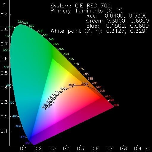
This is our colour triangle. Inside the triangle defines the positions of 6 colors in accordance with reference (plus our White Center). Having gotten measurement, see how wrong our colors are compared with the reference. When they are outside the triangle, we have yperkoresmena colors in our image, and when found inside will be ypokoresmena. When you deviate sideways means that we are wrong as to our gradient. The boxes indicate who should sit our colours according to the reference that we have defined. Saturation and tint values that we strive to achieve for the perfect color triangle are the following:
Red: x = 0.640/y = 0.330
Green: = y/x = 0.300 0.600
Blue: x = y = 0.150/.060
Cyan: = 0.225 x/y = 0.329
Magenta: x = 0.321/y = 0.154
Yellow: x = 0.419/y = 0.505
The above noymerakia are the coordinates of hue and saturation for each color in the color triangle, but not anywhere but in the benchmarks. In an ideal world and projector, achieving these values with the correct brightness as stated above, we get the picture perfect color. However, it is not always easy, all colors to sit in the report because as we proeipei the machines have weaknesses and limitations. Therefore, some compromise is necessary in most cases. With this in mind, we continue …
Starting with the red. See the values that indicate the program after our measurement. We start the settings with the brightness. The regulatory interest in cms menu for the Red is called brightness, intensity, gain etc. (there are many names depending on the manufacturer). If the brightness value of Red is below our 21.2% white, dust with the slider value in order to reach the desired levels. If you are above doing the opposite. Of course, once ayxomeiwsoyme, xanapairnoyme measurement to see who we are. Stop closer to the goal. As with the setting of our grey, so here we try and L (lightness) to be as small as possible.

Then we go to the hue slider (you may see it written as tint) and varying so that our color to come in the appropriate coordinate (x = 640). The pictured with H. Do the same with the saturation slider (chroma, color, etc.) which represents color saturation. The magical noymeraki of interest (y = 330). And C is the wrong of saturation in relation to the reference.
Do the same for the other colors being careful to achieve their respective luminosities, saturations and shades.
This was!! We are ready!! But are we really?
In theory Yes …
In practice, however, things are not so easily and there is easily not why the theory is wrong, but because all software is not the same, nor naturally perfect. Therefore, because, as we have said repeatedly, the picture is a chain of interaction factors, the same happens here. Possibly, therefore, and probably notice while you are configuring e.g. saturation that peirachtike and the brightness or while taking the tint broke down and the saturation. Not aware. Didn’t do anything wrong! This is your machine and how it works.
So … What Facem?
Look, first of all, how good is our Headlight Software regarding the arrangement of colors, namely, whether the various sliders act independently without affecting one another. If this is not possible, please follow the following rules:
The brightness and saturation of primary colors is our first concern. In the same applies for the shade. So, if you see that you need to sacrifice some things, sacrificing nuance of primates and brightness-saturation of the secondary. Be that as it may, the ‘ sacrifice ‘ must be balanced because the picture requires balance. What you will see once you do the first test.
Let’s say, however, and a few words about the machines that don’t have a cms. There are some sliders on virtually all projectors that can help partly in color calibration. These are:
Color = Brightness color primary
Saturation = Saturation of primary colors
Colour Tint Hue = secondary
Bad with these sliders is that it doesn’t lead to autonomous changes in every color, but, at the same time in all three. Therefore, if for example the brightness of Red is more than 21.2%, green under 71.5% and blue below 7.2%, teasing the slider upwards making both, but, put her first. In the same way they work and the saturation/hue. In short, to use these three sliders have to be lucky as to the values of colors in default situation. So it is very important to have cms on the projector to adjust each color.
Good settings!!
Ygiainete!!